Button Macro
Use the Antora btn:[] Macro for buttons and named items that the user clicks in the UI.
The button can be inside the step for a procedure, but the text does not need to be in a procedure to use the macro.
For example, btn:[Submit] renders as Submit.
The following UI elements are considered buttons:
-
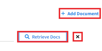
Any clickable element that opens a dialog or pane.
-
Any clickable element that causes an action to happen.
-
Any clickable element that contains an icon.
| A button might or might not have a defined border and color. |
When you need to describe a button in the UI:
-
Refer to the button by its name only. Do not add "button."
For example, Submit.
-
Use the
btn:[]macro to format the button.
If a clickable element changes the screen or navigates the user away from their current location in the UI, use the Menu UI Macro, instead.
For more information about how to use the Button Macro to format your documentation, see Button, Keyboard, and Menu UI Macros in the Contributing to the Documentation guide.
Icon Macro
Use the Antora icon:[] Macro for icons that the user clicks in the UI.
Icons are buttons that do not have an obvious text label - the button name or text label might only appear when you hover over the icon.
The Couchbase documentation uses Font Awesome V4 icons. To find the correct icon name, search the Font Awesome V4 icon library and write it as listed.
For example, icon:plus-circle[] renders as .
Use attributes in the square brackets of the icon macro to customize its appearance and size.
For example, to fix your icon’s width, write fw in the square brackets.
|
When you need to describe a clickable icon in the UI:
-
If the icon has a text label, refer to it by its label, followed by the icon in parentheses. For example,
*Copy* (icon:copy[])renders as Copy (). -
If the icon has no text label, refer to it by the icon alone. For example,
icon:copy[]renders as .