Visualize Results in Charts
- Capella Analytics
- how-to
After you run a query, you can visualize its results in graphical format.
Prerequisites
To use the workbench for Capella Analytics:
-
You must have the
Organization Ownerrole in your organization, or one of the following project roles for the project that contains your cluster:-
Database Data Reader/Writer(Allows queries that read and write data) -
Database Data Reader(Allows read-only queries)
Configure Graph Settings
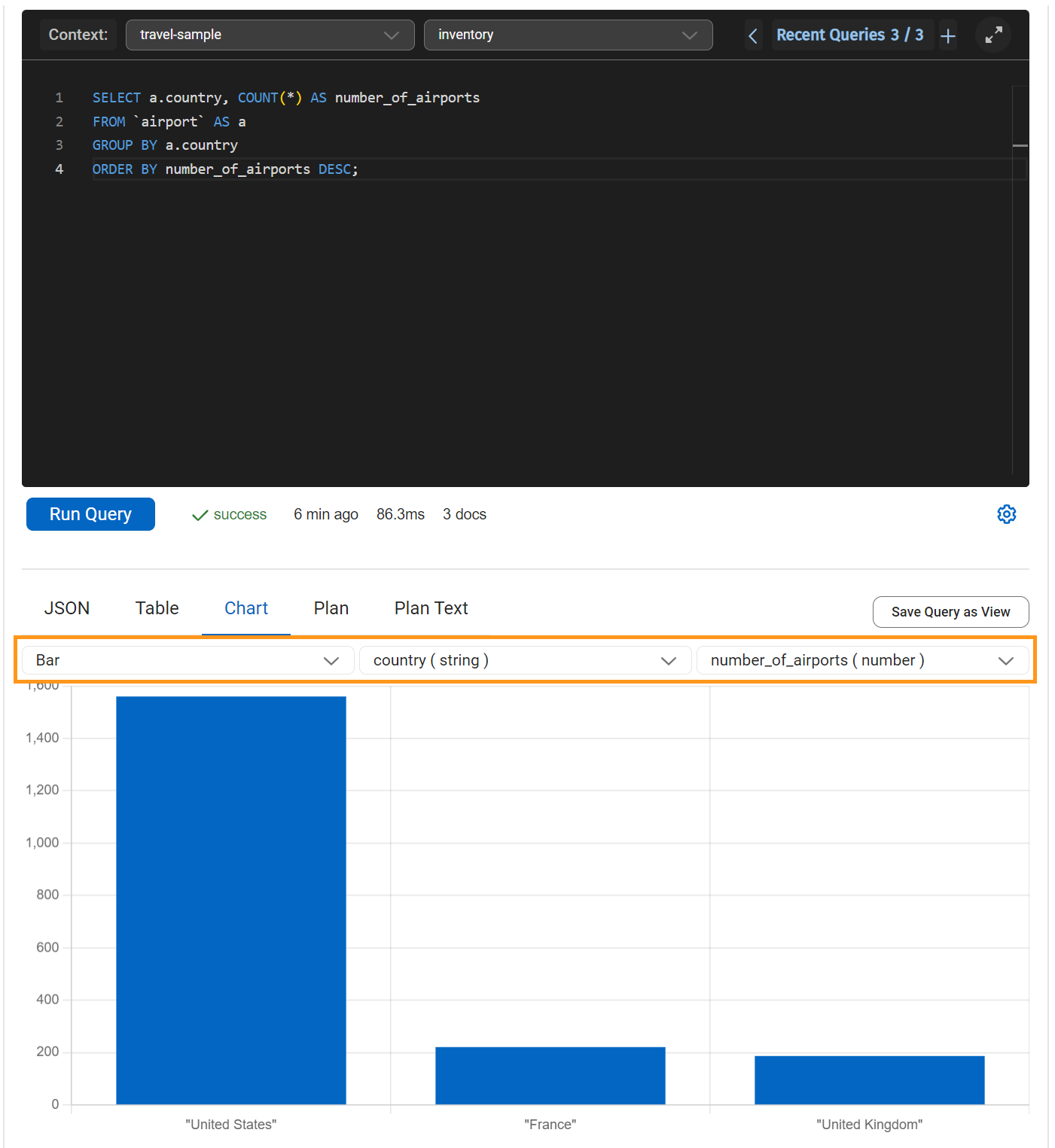
When you select the Chart tab in the query results pane, you can visualize query results in graphical format.
You select the type of graph, and then choose the fields—JSON keys—to include. For example, to populate a bar or pie chart:
-
For the first, x-axis selection you choose a field with a string-type value
-
For the second, y-axis selection you choose a number-type value.
For an X-Y graph, on the other hand, both fields must have number-type values.
In this example for the travel-sample’s airport collection, a bar chart plots the results of a query. The x-axis plots the country and the number of airports is on the y-axis.
For more information about working with sample datasets, see Access Data.
Visualize Results Using AI with iQ Insights
The iQ Insights tab lets you leverage the power of AI to generate relevant questions, descriptions, and visualizations of your query results. You can choose from any of the generated insights and select those that best represent your data.
For more information about iQ Insights, see Explore Results with iQ Insights.